Garmin Venu 3 versus Galaxy Watch – Smart Features Comparison Part 2
Two more weeks of daily usage, and I believe my smartwatch usage scenarios are settled now.
Here is what I can add to my “Garmin Venu 3 versus Galaxy Watch – Smart Features Comparison Part 1” – check it out first – it covers the basics.
Notifications
I have briefly touched on Gamin Venu 3 notification handling in the part 1 already. Since then, I have dived into this topic a bit deeper and found more interesting nuances.
First, and the most disappointing:
My Galaxy Watch showed application icons for all applications I have configured to get notifications from – it simply got the icons from the phone. This was not always the case – I remember when I was using Mi Band 2 (or 3), people discussed how many app icons the band supported.
To my big surprise, the Garmin Venu 3 has the same issue as my old Mi Bad had – it shows app icons for the few most common apps – like Gmail, Google Calendar, and WhatsApp. But it shows a default “SMS like” icon for less common apps – Ticktick (to-do app I prefer), my banking apps, my commute apps, and even Google Keep. Moreover, it groups these notifications together as they would be from the same app. I found that this makes notifications handling worse – it is really hard to understand what the notification really is about.
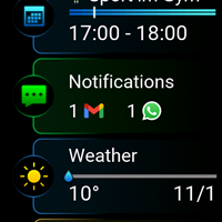
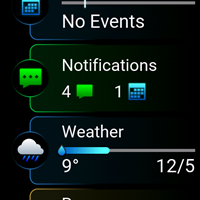
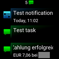
Second, the Galaxy Watch had an option to mute notifications on the phone if they were forwarded to the watch. I always used this feature – this way, I got a notification from a single device only. Garmin does not have this option. As a result, I’m often notified by two devices – not great. So far, this feels like a minor disadvantage for me.
Third, the applications notifications configuration screen in the Galaxy Wearable is way easier to use than the same screen in Garmin Connect. You can filter which apps to show and search for an app by its name, which is very useful. In Garmin Connect, you have to scroll through the huge flat list of all apps – no filters, no search, only manual scrolling.
The last one is a bit special, but still important for many – Garmin Connect does not show applications installed in my work profile. As a result, I cannot forward notifications from them to my watch.
The Flashlight
Venu 3 flashlight screen is not just a white screen, but has a rather nice look. Out of the box, one needs to take more steps to activate the flashlight than on the Galaxy Watch. On the Galaxy Watch, the flashlight is available directly in the quick panel – wake the watch, swipe down, and tap on the flashlight icon. On Venu 3 – the flashlight is a regular application – wake up the watch, click the upper button, tap on “apps”, scroll to the flashlight, and tap on it.
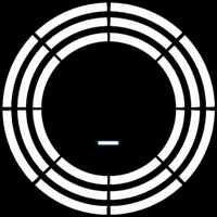
But! Venu 3 allows you to configure a shortcut to start the flashlight directly (Galaxy Watch does not), and this is way faster and more comfortable than the quick panel solution. Especially if the watch is in the “sleep mode”. I prefer the Garmin solution here.
Shortcuts
Venu 3 allows you to configure two physical (middle button tap and hold) and one swipe shortcuts – swipe left from the watch face “screen”. I like this. And I like that none of the buttons are locked for the proprietary payment system (yes, I’m talking about uneditable dedicated Samsung Pay button on the Galaxy Watch).
I assigned one of the shortcuts to the “recent apps” and this itself covers several use cases for me.
Music Control
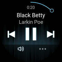
Music Control is there and works fine. But Galaxy Watch tries really hard to offer you this service and shows a “note” icon when your phone plays music (or YouTube, or a podcast), so music control is within one tap distance from you in this case. Garmin does understand that when music is played on your phone, you may need faster access to music control. If you use the feature heavily, you should probably dedicate a shortcut for it. Unfortunately, Venu 3 does not show an album cover either (Galaxy Watch does). I miss this.
Garmin Connect needs Internet. Always.
Garmin Connect is the main watch companion app. Compared to the Samsung stack, it combines Samsung Health and part of the Galaxy Wearable. “Health” is the main scope, and watch management is a “second class” add-on. But, Garmin Connect does not work without the internet. At all. You cannot check your badges, your steps, your anything without the internet. And this is crazy. It is not as painful as it sounds because the watch itself shows way more data than the Galaxy Watch, but this still makes me uncomfortable.
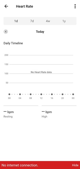
By the way, there is the Garmin Connect web version – the option I wanted Samsung Health offered.
Cover with a Palm Gesture
Both watches have a cover with a hand gesture that turns the screen off. On Venu 3 it works great for me. On the Galaxy Watch, it mostly never worked.
By the way, if you are looking for a fast way to return to the watchface/home screen from any menu or application on Garmin Venu 3, covering it with your Palm is the way to do this.
First Week Battery Life Issue
The Galaxy Watch is known to deliver a terrible battery experience during the first few days, not because you overuse your new toy, but because it learns your usage patterns. My Venu 3 had stable battery usage from day 1. It still learns my body’s baseline parameters, but this is another story.
Phone Widgets
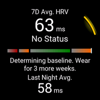
Samsung Health and Galaxy Wearable offer several Android widgets (from watch battery level to steps counter). Garmin Connect offers no widgets at all. This is a bit strange, but this plays no role for me.
“Watch is charged” Notification on the Phone
Galaxy Wearable can raise a notification on your phone when your watch is fully charged. This is a very handy option if you need to charge your watch around an hour every single day 🙂
Calculator
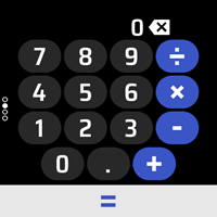
Venu 3 has no calculator pre-installed. But there is one from Garmin you can install from the IQ store. And it is very good – works great. Checked.
Voice Recorder
I expected a third-party voice recorder apps to be available. I do not know what made me confident about this. Anyway, there are none. And this is sad.
The weather app
It sounds crazy, but Garmin weather app on Venu 3 does not show sunrise and sunset. And this is not because the app is that primitive – it shows this info on the other models – most probably, Garmin believes that sunrise and sunset time is a super outdoor features, like offline maps and therefore includes this “feature” to the corresponding models only.
Same story with the air pressure history – the weather app shows actual air pressure, but no history/trend.
Conclusion
As a smartwatch Venu 3 is significant downgrade in comparison to Galaxy Watch. Even without touching heavy features like, voice2text on the watch, 3pp apps like WhatsApp, internet browsing, automation etc. If you need all that – Garmin is not for you.
Basic smartwatch features coverage has significant differences as well. I hope that this and the previous article demonstrate why one calls Garmin Venu 3 and other Garmin watches a “fitness first, smart second” device. I hope that now you can make more educated decision about a such important device as a watch.


I had a Galaxy Watch 4 but it was terrible in terms of battery life. Barely 24 hours of battery I could squeeze out of it. My biggest gripe was with it’s charging though. In normal conditions, it took 2 hours easily to top up from 0 to full but I live in tropical conditions and summers are harsh here. And the wireless charging generated so much heat that the watch throttled itself and either charged even more slowly or simply refused to do so for some time[in order to cool down]. I personally had to put in front of a fan or something like that for it to charge properly.
Since Samsung still refuses to put in a low power display like One Plus Watch 2 or something similar to what Ticwatch has done[ both have nearly 3 day battery life, twice the Samsung Galaxy Watch 6 and hopefully still equivalent to the coming ‘Ultra’ Model ], charging is a pain.
My GW4 with AOD on did better than 24 hours, but I’m in another climate zone.
I do not share your view on “low power display” – it adds complexity, destroys the overall interface design, adds lags and does not adds that much battery life. TicWatch and one plus watch 2 are huge watches. GW5 Pro which has a comparable size has comparable battery life without a second display.